The “High-Performance HMI Handbook" was released five years ago and, though it did not make a huge splash upon its release, the ripple effect it created throughout industry has been noticeable. In just a little more than a year, I’ve seen the HMI design tenets raised in the handbook praised by Opto 22 with the release of its groov HMI design software; seen Invensys roll out its new System Platform and InTouch 2014, which uses High Performance HMI design as a key reference point in its Style Guides; heard Steve Elwart, former director of systems engineering at Ergon Refining, detail at The Automation Conference the need for simpler HMI screens as a critical element of effective alarm management; and listened to Keith Dicharry, process and automation leader at BASF’s Freeport, Texas, plant explain how the HMI design guidelines outlined in the handbook have dramatically improved operator performance at the plant. Most recently, I had the opportunity to attend a session on the “Secrets of Highly Effective HMIs” at the Inductive Automation user conference. The presenter, Carl Gould, co-director of software engineering at Inductive Automation, began by stating that his presentation was largely drawn from the “High Performance HMI Handbook.”
With so much support for the handbook’s HMI design principles coming from both suppliers and users alike, it raises the question of why these design principles are not more frequently found throughout industry.
“Before the handbook, there were no published guidelines about what made a good HMI screen or bad one,” says Gould. The clear trend with highly graphical HMIs over the past two decades has been to “draw a P&ID (piping and instrumentation diagram) and sprinkle values over it. With the increasing graphics capability of computers, the temptation has been to make screens as fancy as possible. As a result, there has been an underuse of trending data on HMI screens and little use for analog data. Even though these new graphics are very attractive, they’re only adding distracting elements to the HMI.”
Gould adds that the biggest reason to move away from the use of highly graphical HMIs is safety; and along with that added safety come improved production and profits as well as reduced training needs.
To illustrate the value of a less graphic-heavy approach to HMIs, Gould shared data from the ASM Consortium comparing graphic-heavy HMIs to those designed using the principles espoused in the handbook. One of the data points Gould highlighted noted that early detection of faults using graphic HMIs was 10 percent versus 48 percent using simpler HMI design.
But many people are still resistant to the simpler HMI design, according to Gould, because—quite simply— the highly graphical approach is so much more attractive and can, in some cases, help sell the HMI software.
To move past the sheer attraction of highly graphical HMIs and toward a more effective design, Gould says it’s important to realize that the first goal of a highly effective HMI is to “turn data into information. To do this, you have to put the data shown on the HMI into context to make it useful. For example, having a temperature reading next to a motor on the HMI is good, but that doesn't tell you if the temperature shown is too high, too low, average, or something you should be concerned about,” he says.
The next goal of a highly effective HMI is “speed of interpretation,” Gould says. “An operator should be able to gather information from the HMI at a glance. This involves is exploiting human abilities such as pre-attentive processing and peripheral vision.”
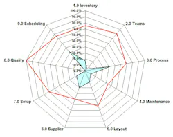
One of the more effective means of doing this is via a graphical charting element known as a radar chart or spider plot. This kind of chart “takes advantage of human pattern recognition,” Gould says.
If you’re unfamiliar with a radar chart/spider plot, the basic definition is that it consists of a sequence of equi-angular spokes, called radii, with each spoke representing one of the variables being tracked. The data length of a spoke is proportional to the magnitude of the variable for the data point relative to the maximum magnitude of the variable across all data points. A line is drawn connecting the data values for each spoke. (See image example at top right of article for an example using production operations data.)
To under this better in an industrial application, consider a radar chart displaying asset temperatures on an HMI. If everything is running perfectly, the temperature line connecting the radii of assets tracked will appear as a circle—or close to it—on the chart. This means that the radar chart can be very useful at highlighting anomalies in multi-variant, data dense displays. In these charts, any outliers are shown as jutting out from the circle.
The popularity of radar charts with operators at BASF was surprising to Dicharry. In his presentation at the PAS conference, he noted that many operators—who now design their own HMIs as part of BASF’s “control room of the future” project—have opted to use radar charts prominently in their HMIs.
If you want to experiment with radar charts on your own, an easy way to begin is by using Excel.
It’s clear that HMIs are at some kind of inflection point in terms of which type of HMI design will win out in the long run. Which camp are you in? Feel free to share your opinion about highly graphical or simple HMIs and which you prefer and why.
About the Author


Leaders relevant to this article: