The Benefits of User Experience and Interfaces in an Industrial Process

Manufacturing execution systems (MES) save, historicize, view, and manage a huge amount of data that comes in from the field. All these operations have a unique purpose: provide the correct information which allows them to manage machines and processes in any situations, as soon as possible. A good challenge. So, what’s the struggle? What can we do to facilitate that goal? We have to make that data manageable and usable.
At Autoware, our approach considers two fundamental issue: user experience design and brand user interfaces. User experience design considers flows, object positioning (grids and buttons), alarms acknowledgment, standard pattern in according to the average age of employees’ dashboard, and much more. It’s an analytical process that answers the question, “how does it work?”
Brand user interfaces considers the brand’s colors, target market, and standards of colors and shapes.
Take a craft beer startup as an example. The edge of the button and elements of the content are used to create a young and confidential tone. In contrast, take blues and greens of the pharma industry. The edges are less smooth to make the tone stronger and more serious. In addition, the affordability for visually impaired is a fundamental topic: contrasting color and size of graphic objects. In this case the process is more creative and answers the question, “how does it look?”
These two processes are collateral and necessary because a good user experience and a good graphic look has to coexist. The app must be easy to use but it must also look pleasing to the operator.
Consider, for example, fluorescent or grey colors for all components. Otherwise, a good graphic appearance without right components in the right positioning doesn’t allow for good navigation.
All of us are influenced and we don’t even notice, because we use smartphones and tablets every day. We repeat the same routine every day, we can do everything using an app. At Autoware we apply the same method of study: How our brain sees and understand forms, spaces, and colors. There are some rules that we can use to lead the viewer's eyes and their attention.
Gestald wrote these rules and they became official in a beginning of the century. They are very important because they identify visual perception process and optical illusions.
There is a philosophy that leads this process, “An organized whole is perceived as greater than the sum of its parts,” (one example is below).
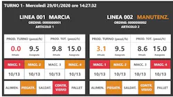
A client asked us to have the status of the assembly lines clearly visible in real time. This dashboard was to be viewed on a medium-sized TV positioned in a control room, above the windows that overlooked the system. In the amount of data to be displayed, we have chosen to use and combine different laws to have a clear and precise view of production succinctly.
Proximity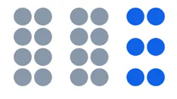

The first thing that we can see is the left-right symmetry of the two parts. They are two production lines that basically have the same functions. It goes without saying that it is easy to make the interface symmetrical.
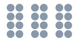
Proximity is divided in two. A first group, with little space, visually joins the elements by line and vertically. A second group, that has more space, is the one that divides the right from the left. The eye flies on the display in a completely natural way, immediately perceiving the difference of the areas, without the need to add any additional dividing element.
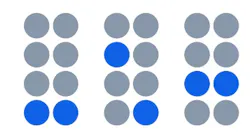
The similarity in the elements was done by row. Each contains elements that are identical to each other and are immediately visible in a straight line for continuity.
Based on the customer's indications, in addition to the skimming of the less important data, a visual hierarchy has been applied which privileges some values over others with a larger font size.
Here, the use of colors also plays an important role. Thanks to a high contrast between the text and the backgrounds, a calculation of the font size on a TV and user distance basis, all the elements are easily visible and distinct. In addition, highlight only the warning alarms in orange and the critics in red, even at a superficial glance the attention is captured by the points of real interest.
Looking at this interface, you can think that it was easy to do. The truth is that it hides a great teamwork of people with different skills.
This is our approach today, who knows what wonderful challenges the future holds.
Federico Andreose is a software engineer at Autoware, a certified Control System Integrators Association (CSIA) member based in Vicenza, Italy. For more information about Autoware, visit its profile on the CSIA Industrial Automation Exchange.
About the Author
Federico Andreose
Software Engineer at Autoware

Leaders relevant to this article: